
WinRT GridView with inline group headers and semantic zoom
My Windows 8 app had a GridView with grouped content and also made nice use of semantic zoom to make navigating between those groups easy. All I wanted to do was to make the headers appear in the content like the People App. I thought this would be a simple case of finding the right container template to use, but after reading this post by Mike Taulty it turns out that using the group style built into GridView can't do this. His post goes into a lot of detail about how to figure out your XAML and shows a GridView with inline group headers. I've taken his method and extended it to include semantic zoom.
This is what we'll be creating:
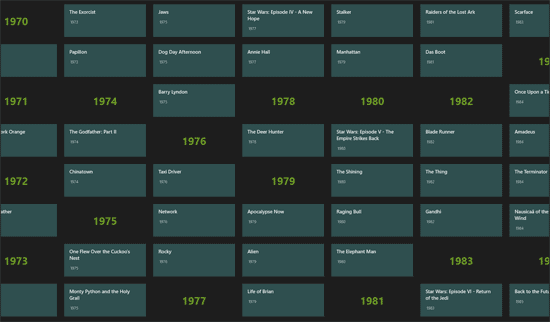
This example is a simple app that uses a GridView to show the top 250 films grouped by year. I'll talk you through the steps but the source code is available on Bitbucket.
I've also tagged the various versions with the steps I've gone through so you can see my example progress.
Step 1 - A GridView showing headers and items
To create a GridView with headers shown in the body of the GridView rather than above it, the headers need to be added as items to the GridView's ItemsSource list.
To manage the groups and the items I've created a GroupCollection<T> and Group<T> class. GroupCollection holds our groups of items, but also gives us access to a list of all items with the headers included. Feel free to use these classes and modify them if you need to, or just borrow the bits you need.
Setting up your grouped data
In App.xaml.cs create a static member variable to hold our film data
public static GroupCollection<Film> FilmData;
We then initialise this collection when the app loads:
IEnumerable<Film> films = CreateFilms();
FilmData = new GroupCollection<Film>(null, f => f.Year.ToString());
FilmData.AddItems(films);
The clever bit of GroupCollection is that it takes a lambda expression grouping rule which groups the items and gives those groups names. In this case we are grouping films by their year.
FilmData now has the following useful properties:
- FilmData.Groups - A collection of all the groups containing our films
- FilmData.ItemsWithHeaders - A collection of all the items with the groups included to server as headers
Displaying the films and group headers in a GridView
In our XAML page MainPage.xaml we set FilmData as the DataContext for the page and add a GridView bound to this list:
<GridView ItemsSource="{Binding ItemsWithHeaders}" ItemTemplate="{StaticResource FilmItem}" />
There is an item template for our Film item in MainPage's resource dictionary. I won't show it here, but it currently doesn't show our group headers well.
Step 2 - Headers with their own display templates
To display the film items and group headers differently we need to create a DataTemplateSelector that knows the difference between a film and a group of films. Here is an example of a DataTemplateSelector class which does the trick:
class ItemOrHeaderSelector : DataTemplateSelector
{
    public DataTemplate Group { get; set; }
    public DataTemplate Item { get; set; }

    protected override DataTemplate SelectTemplateCore(object item, DependencyObject container)
    {
        var itemType = item.GetType();
        var isGroup = itemType.Name == "Group`1" &&
            itemType.Namespace == "NogginBox.WinRT.Extra.Collections";

        // Disable headers so they can't be selected
        var selectorItem = container as SelectorItem;
        if (selectorItem != null)
        {
            selectorItem.IsEnabled = !isGroup;
        }

        return (isGroup) ? Group : Item;
    }
}
It also disables the item container for headers so you can't click on them. We then need to make our GridView use this DataTemplateSelector and create the two templates it selects. Modify the GridView code to this:
<GridView ItemsSource="{Binding ItemsWithHeaders}" ItemTemplateSelector="{StaticResource FilmItemOrHeaderSelector}" />
The selector and templates need to be included in the page's resource dictionary:
<Page.Resources>
  <ResourceDictionary>
    <DataTemplate x:Key="FilmHeader">
      <Border Margin="6" Width="250" Height="100">
        <TextBlock Text="{Binding Title}" Foreground="GreenYellow" FontSize="32" FontWeight="Bold" HorizontalAlignment="Center" VerticalAlignment="Center" />
      </Border>
    </DataTemplate>
    <DataTemplate x:Key="FilmItem">
      <Border Margin="6" Width="250" Height="100" Background="DarkSlateGray">
        <StackPanel>
          <HyperlinkButton NavigateUri="{Binding Link}">
            <TextBlock Text="{Binding Title}" Style="{StaticResource ItemTextStyle}"/>
          </HyperlinkButton>
          <TextBlock Text="{Binding Year}" Style="{StaticResource CaptionTextStyle}" Padding="20,0,0,0" />
        </StackPanel>
      </Border>
    </DataTemplate>
    <selectors:ItemOrHeaderSelector
    x:Key="FilmItemOrHeaderSelector"
      Item="{StaticResource FilmItem}"
      Group="{StaticResource FilmHeader}" />
  </ResourceDictionary>
</Page.Resources>
If all you want is a GridView showing groups with inline headers then we're done. Read on if you want to add semantic zoom.
Step 3 - Adding semantic zoom and linking the two views
The nice thing about a GridView using the grouped style is that semantic zoom just works. As we're not using the build in groups feature we need to do a little bit extra, but it's not too hard.
First we add the SemanticZoom control to MainPage.xaml:
<SemanticZoom x:Name="FilmZoom">
  <SemanticZoom.ZoomedOutView>
    <GridView ItemsSource="{Binding Groups}" ItemTemplate="{StaticResource GroupTemplate}" />
   </SemanticZoom.ZoomedOutView>
  <SemanticZoom.ZoomedInView>
      <GridView ItemsSource="{Binding ItemsWithHeaders}" ItemTemplateSelector="{StaticResource FilmItemOrHeaderSelector}" SelectionMode="None" />
  </SemanticZoom.ZoomedInView>
</SemanticZoom>
Now we just need to link up the zoomed in and zoomed out view using the ViewChangeStarted event:
FilmZoom.ViewChangeStarted += OnZoomViewChanged;
And here is the code for that event:
private static void OnZoomViewChanged(object sender, SemanticZoomViewChangedEventArgs e)
{
  if (e.SourceItem == null) return;

  if (e.SourceItem.Item.GetType() == typeof(Film))
  {
    var sourceFilm = (Film)e.SourceItem.Item;
    var fontsGroup = App.FilmData.GetGroupFor(sourceFilm);
    e.DestinationItem = new SemanticZoomLocation { Item = fontsGroup };
  }
  e.DestinationItem = new SemanticZoomLocation { Item = e.SourceItem.Item };
}
Now we've implemented semantic zoom and our two views are linked.
That's pretty much everything, but what if you've got some empty groups. My GroupCollection<T> class doesn't add these to the ItemsWithHeaders collection so they don't get shown in the zoomed in view. They are included in Groups so they'll be show in the zoomed out view. You might want to show them differently, which we'll cover in step 4.
Step 4 - Zoomed out view with different template for empty groups
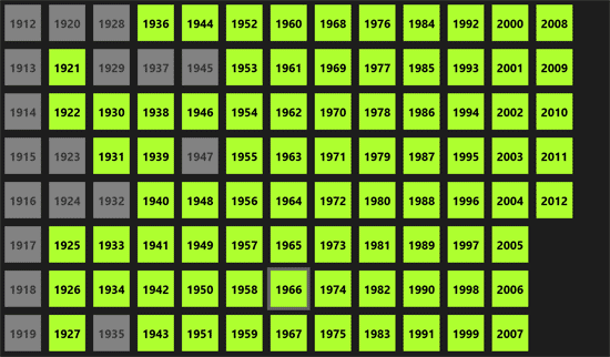
My CollectionGroup<T> class will only create groups that are used by the items in it, but you can initialise it with a list of group names like this:
var films = CreateFilms();
var yearHeaders = Enumerable.Range(1912, 100).Select(t => t.ToString());
FilmData = new GroupCollection<Film>(yearHeaders, f => f.Year.ToString());
FilmData.AddItems(films);
We now have some empty groups so we can create a new DataTemplateSelector that chooses different templates based on whether the group is empty or not. Here is the template selector:
class EmptyOrFullSelector : DataTemplateSelector
{
  public DataTemplate Full { get; set; }
  public DataTemplate Empty { get; set; }
  protected override DataTemplate SelectTemplateCore(object item, DependencyObject container)
  {
    var groupItem = item as Group<Film>;
    var isEmpty = groupItem == null || groupItem.IsEmpty;

    // Disable empty items
    var selectorItem = container as SelectorItem;
    if (selectorItem != null)
    {
      selectorItem.IsEnabled = !isEmpty;
    }

    return (!isEmpty) ? Full : Empty;
  }
}
Add this selector to the zoomed out GridView:
<SemanticZoom.ZoomedOutView>
  <GridView ItemsSource="{Binding Groups}" ItemTemplateSelector="{StaticResource GroupTemplate}" />
</SemanticZoom.ZoomedOutView>
Now add the selector and templates to the page's resource dictionary:
<DataTemplate x:Key="GroupTemplate">
  <Border Margin="6" Width="100" Height="100" Background="GreenYellow">
    <TextBlock Text="{Binding Title}" Foreground="Black" FontSize="32" FontWeight="Bold" HorizontalAlignment="Center" VerticalAlignment="Center" />
  </Border>
</DataTemplate>
<DataTemplate x:Key="EmptyGroupTemplate">
  <Border Margin="6" Width="100" Height="100" Background="LightGray">
    <TextBlock Text="{Binding Title}" Foreground="Black" FontSize="32" FontWeight="Bold" HorizontalAlignment="Center" VerticalAlignment="Center" />
  </Border>
</DataTemplate>
 <selectors:EmptyOrFullSelector
  x:Key="FilmGroupEmptyOrFullSelector"
  Empty="{StaticResource EmptyGroupTemplate}"
  Full="{StaticResource GroupTemplate}" />
And we're done.
Step 5 - ?
There's one last thing that I would like to do, but I've not figured out how yet. Sometime a header is the bottom item of a column and this doesn't look great. It would be nice to find a way to make sure that a header always has an item below it. I think the best way to do this would be to insert empty items in the list to stop headers being at the bottom of a column. I'd also like it to still work if items were removed from the list. Any ideas?
Sam said
Brilliant, thanks!